
I partnered with SignBiz to develop a Brand Identity and logo system for OM Signs and Graphics. As a designer, I always look forward to working with clients that are passionate about their business. Vinay and Urmila brought wonderful energy and excitement to the design process and put a lot of thought and care into choosing the final logo. 
Vinay and Urmila took the time to communicate the meaning behind each element of their initial logo concept and what they wanted to achieve which made my job as a designer easier as I set out to develop their logo.
 They explained that the word “OM” is the most synergetic word in Sanskrit and is the purest form of energy. We placed the “OM” at the center of a sun with distinct rays to represent core energy, power, purpose, and growth.
We chose a bold font for “Signs and Graphics” to stand out and directly communicate the main services they offer.
Their tagline “Shine with Signs” was the final element added to pull the logo together. It was important to them that customers know that if you connect with OM Signs and Graphics, they will rise to the occasion and help your business shine with signs.
![]() As a team, we went through several rounds of logo variations and color palettes until Vinay and Urmila were sure it was just right. They took great care to settle on colors and an overall aesthetic that is bright and inviting and aligns with their personalities.
As a team, we went through several rounds of logo variations and color palettes until Vinay and Urmila were sure it was just right. They took great care to settle on colors and an overall aesthetic that is bright and inviting and aligns with their personalities.
It was a pleasure working with OM Signs and Graphics and I look forward to seeing their business grow as they serve their customers with the same thoughtfulness and professionalism. 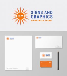
Graphic Designer and Owner